How to Optimize Your CTAs for Conversions
Updated October 8, 2021
10 min read

The best email marketing is when you are able to get a subscriber to do what you want, by clicking on your call to action (CTA). This is the first step in the conversion funnel. The aim is to get a response and the best email marketing strategy your emails should consist of three key points:
- A strong subject line to hook your audience and get them to click your email. An eye-catching design that stands out amongst the rest of your text and draws attention will help get users to click. A CTA should be in contrast to the rest of your copy or any information that you provide in your emails or on your website.
- An offer that provides value to them. Include a value proposition in your CTA. This explains what your user will get out of clicking on your CTA. You should highlight the value that they will receive once they take the next step in their customer journey.
- A clear call to action to get them to click. By using powerful language and keeping it short, and sweet, action words is the best practice of your CTA. The more direct the better.
Optimize your CTAs and get results
Once you’ve been able to hook your reader with your email, you need to direct them toward clicking. This process might sound difficult, but there are plenty of resources and best practices to turn your call to actions into powerful results. We will continue to dive deep into the power of CTAs and the best practices to help you optimize your email campaigns to get more conversions.
Let’s define a CTA
A call to action is a button or link that will prompt your readers to click and enter a new window. This typically will direct them to a landing page with price information or valuable information about your product or service.
When you think back on the emails that you’ve received from brands you subscribe from, how did they entice you to read further or find out more about their products or services? These could come in forms of tantalizing images or alluring copy, but what they all have in common is that they have a precise call to action button or link that shows you exactly where to click for more information or take a certain action.
CTA in email marketing
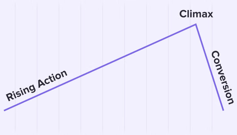
A call to action should be the most climactic point of your email. It is where the story has reached its tipping point and the reader then gets to decide what step to take next. Similar to choosing your own adventure book. Like any climax of a story, a call to action doesn’t work unless other parts are helping build its interest.
 You need to curate a story starting with a compelling subject line. You can hook your readers with a subject line by either putting the offer right there on the table, using their name and making it very personal or by stating a startling fact (just to name a few examples). After, you need to continue your story with the content and design of your email. Some emails follow a more strict template than others so you need to keep this in mind when designing your CTA.
By the time your readers get to the call to action button or link they are then primed and ready to click. Ask yourself these questions, “Does your subject line, content and CTA all work together? Are they a cohesive story? Would you yourself click on this CTA if you received this same email?”
Why are CTAs important?
They will keep your users moving and motivated
Without a clear CTA, people will have no idea what to do next. You might have created a beautiful storyline for them or a customer journey but if they don’t know how to move through it, they will not go the extra mile to figure out the best next step. Without a CTA it can quickly lead to a stagnant sales cycle that will not convert as best as it could.
Helps create a user-led customer journey
As mentioned above, a CTA is part of the customer journey and is similar to a choose-your-own-adventure book. When a customer responds to a CTA it is called a conversion. This is great because it’s easy to track your conversions because most softwares allow you to see how many people have moved from one page to the next. This is a great way to track the customer journey and decide what actions customers take to get a sale.
CTAs are easy to measure
Each CTA is a mini conversion point that can be tracked and measured. When you see which CTAs get the most conversion as well as what the users do next, you can then use this information to improve your customer experience and sales cycle. This is valuable information to see what your customers like and dislike about your sales cycle and what part they drop off in the customer journey.
CTAs increase conversions
No user wants to do any extra work than they have to. People are busy. No one has time to read every single character in the email, but research proves that CTAs are read by 90% of e-commerce visitors. So, the larger amount of eyes on your CTAs the more likely you are to increase conversions to your site.
CTAs prompt immediate action
The attention span of an internet user is very low, so it’s important to keep them engaged and interested throughout your email and through your sales cycle. A CTA helps achieve this by giving them simple and easy points of interaction.
What CTA prompts someone to click
Calls to action will typically be bright colored and in a specially chosen placement. But the best CTAs will be those that are precise, with actionable verbiage to attract attention. A few examples of eye catching CTAs:
- Start my trial
- Learn more
- Take 50% off
- Register now
Some may even ask what is the best color to have a converting call to action. Let me tell you, you’re going to get various answers. Psychologically, color has a profound effect on people and their decision-making.
For example, the color of a room can affect a person’s mood, or the color red has been proven to show a rise in blood pressure and increase the speed of respiration in others. In one study, researchers at the University of British Columbia showed that blue was proven to enhance creativity, while red was shown to increase memory and attention to detail. It seems that marketers should also be able to use the “psychology of color” to create more enticing and persuasive logos and call to action.
Best Practices for Creating CTAs
Some could say that creating a call to action is an art form, they need to be both compelling and converting. If you want to get the most out of your CTA and drive more conversions, you need to take note of these best practices:
Use targeted CTAs
Much like segmenting your email lists, you should be using segmented CTAs for your customers. Every user has a different experience with your product or service so they will all have different needs and requirements through their journey. Not every customer journey is the same. To avoid obviously templated emails or a generic sales cycle, use targeted CTAs based on past user behavior. For example, you can use a CTA based on user intent or on what part of the buying cycle they are on.
Display your CTA in the right place
You can have the most beautifully designed or powerful CTA, but if nobody sees it, you will never get results. By using tracking software, you can see which CTAs get the most results from users and experiment where you decide to place them in your emails or throughout your website. Common places for CTAs are:
- At the top of the landing page
- At the end of your email
- In a pop-up window
- In the website footer
- Halfway through a blog post
Make your CTAs pretty
As we mentioned above, there is a whole psychology of colors but there also is the psychology of good branding. If a message or logo looks appealing to the eye, people are more likely to click on it. For example, you wouldn’t click on a button that seems like it could lead you to a fake website or one that looks “gimmicky”, you would click the button that looks neat and clean and that also aligns with the brand’s aesthetic.
Test your CTAs
Much like how you can test your emails through A/B testing, you can do the same with your CTAs! This means you test two varieties of CTAs and see which one performs better, and which one gets the most clicks. You can change and update the copy, color, and image that are associated with the CTA to see which elements best resonate with your audience.
Keep it simple
As we know, consumers are busy and no one likes to waste time on a product or service that they don’t necessarily need. Presenting them with long-winded CTAs will take even more time out of their day to read and it simply doesn’t work. Instead, be brief and get to the point as soon as possible. This makes it way easier for your users to know what step you want them to take next and eliminates any guesswork.
Your CTA should be, ideally, as short as possible. Anything more than 10 words is way too long. Think of it this way, you want it to fit in a nice button size and use statements that a user can read in a split second.
Make it personal
Put yourself in your consumer's shoes. You like it when companies make you feel special and feel like they took the time to curate content to your liking. So utilize this in your CTAs, by using first person pronouns like “I” and “me” it will make your customers feel more part of the process, encouraging them to take action because the CTA was specially designed for them.
Make your CTA a button
Having your CTA stand out is crucial. You need your visitors and subscribers to see them as soon as possible so it’s important that they look different from other elements on your site (such as a button). By switching from text to button format, taps into human psychology that a button is for clicking. Who can’t resist clicking a big red button?
Use action verbs
CTAs are literally calls to action, so you need to drive the action. You want your customers to take that next step and the best way to do so is by using powerful action based words that will tell them what to do next. Words like “subscribe”, “download”, and “join” are simple and easy to understand but also instill a sense of urgency that a user will get something out of clicking the CTA.
Create a sense of urgency
Speaking of urgency (we just mentioned it above), urgency makes people take action. This is exactly the result that you want to get from your CTAs. For example, by adding in a time sensitive offer or limited timeframe it gives your consumers the extra push they may need to click. You could even install a countdown timer to make your CTAs more urgent.
The three traditional types of CTAs
1 - Text CTA
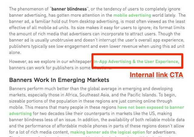
A text CTA is encompassed with part of the website and will blend within the rest of the text. This type of CTA is a “native” form that will consist of a hyperlink and the value proposition that it encourages its users to click through.
 2- Button Style
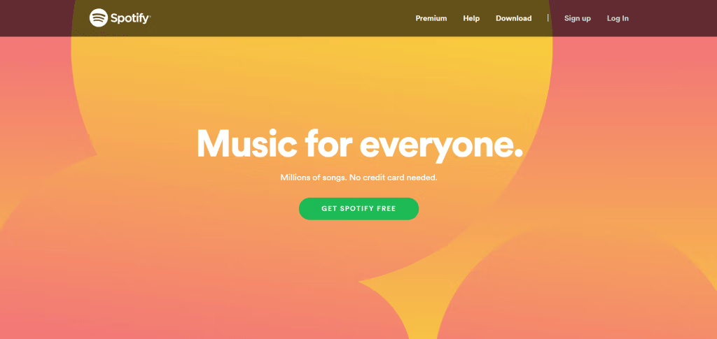
This is the most common form of CTA. It is an action phrase that is embedded in a colorful button that will tap into human psychology for your consumers to click it. These buttons are typically the most eye-catching thing within your email or on your website. They will be the first thing a user notices and should be easy and simple to understand. You want your consumer to click the button as fast as possible and get that conversion.
 3 - Banner CTA
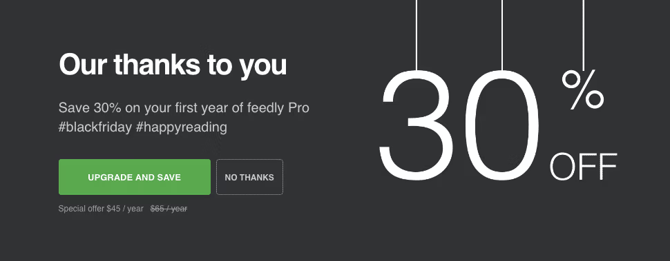
Banner CTA are not as popular as in text or button CTAs but they are on the rise. Especially with websites that have large hero images at the top. They act as a block or popup on a website that is dedicated just to a CTA. With a banner CTA they also include a bit of text that describes the value proposition with an image and an action based button. So it’s a hybrid between in text CTA as well as a button CTA but with a twist.
 Your CTA is Important
You may think that a CTA is just a small piece of your email campaign or website, but they are one of the most important elements of your marketing efforts.
When you get your CTAs right and working well, it can mean the difference between losing customers to your competitors and significantly increasing your click through rates. If you want to boost your conversions, you need to be optimizing your CTAs to make sure that your audience is reacting to them.
Remember, the only successful email campaign is one that gets delivered. All of this information is null if your emails never reach your target audience. By keeping your lists clean and having up to date email addresses, this is the best way you will increase your conversions along with your CTAs. Take a look at your email lists with Emailable and see how many addresses you are actually delivering to. You may be surprised!