10 Welcome Email Examples to Greet Newcomers with Open Arms
Updated January 18, 2023
9 min read

Imagine you’ve just bought a new house and are moving to another neighborhood.
As custom has it, the “new kid on the block” answers the door to the neighbors with excitement. The latter, for their part, bring a housewarming gift: a Shepherd’s pie, a doormat, decorations, a cutting board, and whatnot. In a nutshell, the neighbors try to welcome a newcomer and earn the first impression.
The same goes for the business world. Once a user subscribes/buys stuff/leaves their email on a brand’s website, the matter depends on the brand: it’s supposed to send the user a welcome letter. In this post, we’ll walk through its definition as well as 10 steal-worthy examples so that you always have a prototype and the muse stays with you.
What is a welcome email?
A welcome email is the first letter a customer receives after they step into a relationship with a business. As the name implies, it greets a person and tells them what to expect from this partnership (but not always, stay tuned!). Besides, this is your chance to show the company’s goals, mission, and unique bottom line. Don’t blow it off!
What tone of voice should you choose for this kind of email? It’s more than simple: inviting and informative, with no fluff. You should also keep in mind that thanking users for joining the gang means the world to you, and they won’t regret it.
Explaining the importance of welcome emails
Even though chat software seems like a seamless and faster way to communicate with a new clientele, emails hold a steady promise, too. They could be automated for a better experience and don’t depend on your team’s circadian rhythms. So before we jump deeper into the topic, let’s touch base about the importance of a welcome letter.
Other than it just DOES work, you can also WOW users and hold their attention for long. But it should be an awesome, well-designed email. Plus, they save time and prevent you from manually contacting every single lead. Last but not least, a welcome letter helps build loyalty (especially within the first 48 hours after subscription.)
Another crucial thing to remember is email verification – the process of finding out whether the addresses you are going to send letters to are OK, not spam, contain no errors, etc. To put it simply, every valid email address improves your sender’s reputation and perfects email deliverability.
But all of this will deliver thoroughly under one condition, though – if you played your cards right. And who are we not to show you the rules?
10 awesome welcome email examples you might be interested in
Below you will find 10 real-life welcome email examples. Each of them is diverse, with its own tactic behind the curtain. Would you go for a single option or does mixing them together sound more promising? It’s your call!
1. Introduce special deals and holiday promotions
Starting off on the right foot adds hundreds of points to your business in its welcome campaign. But if you think that talking about the company’s values or benefits is mundane, offer something that could grease new subscribers’ fists – special deals and time-limited offers, to name a few. And as the holiday season kicks in, welcoming customers via email is becoming even easier.
To open our list of welcome email examples, let me show you the one from The Good Ritual – a coffee production brand. Being a coffee geek myself, I couldn’t miss out on it.
Anyway, once a user subscribed to their newsletter, they send them a letter offering a discount for the first purchase. Something that helps the business win users’ hearts once and for all:
 2. Provide tips on how to get the ball rolling
Put yourself into your newcomer user’s shoes. You just subscribed to a product or service and…that’s pretty much it. But from the business point of view, the newly registered people are like a clean slate – they would do and go in the direction you will provide for them. And that’s the tactic you might want to use in your letter.
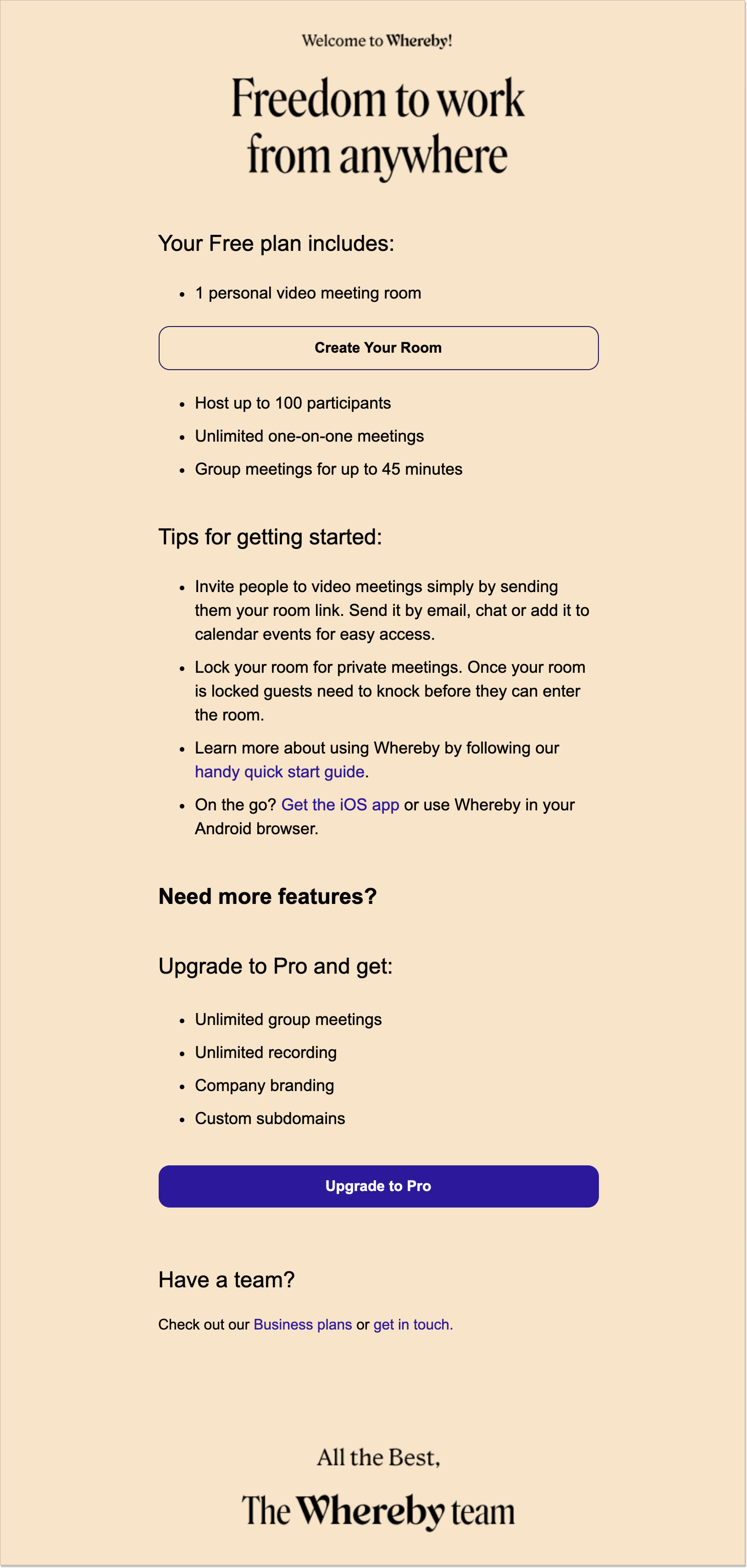
In this welcome email example, Whereby makes a smart move – presents tips on how a user can start with the product. They include just a few points and top them up with the CTAs: to read extra material and get the iOS app.
 3. Showcase the reasons why people stick to you
Sometimes, throwing mesmerizing benefits or numerous steps to kick off with a product or service in the first email might not be the perfect plan. Why? Well, when people sign up for an unknown business, they usually wait for a friendly welcome, a sign that they stepped on the right path.
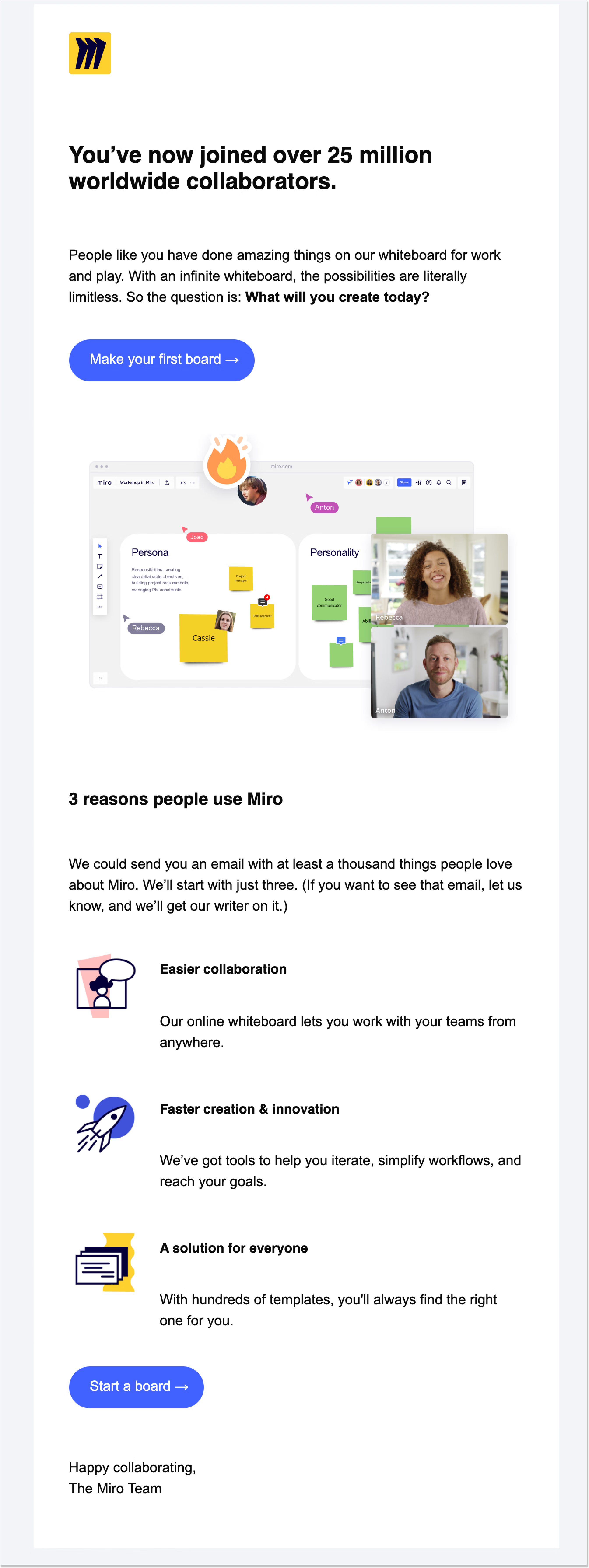
The Miro Team decided to do just that and flashed 3 reasons why other subscribers follow the business. 3 short sentences. This might seem not enough. However, such a move makes a customer trust a brand even more and builds the overall reputation.
Besides, Miro used another trick: they dropped a hint that there are nearly “a thousand things people love” about the company. Why would they lie about it?
 And don’t forget that a picture is worth a thousand words! Thus, another powerful way to tell your subscribers in the welcome email about the love of your existing customers: include user-generated content in emails.
4. Create an eye-catching subject line
Don’t underestimate a subject line. 69% of email recipients mark a letter as Spam after reading it. This scenario could be true due to one simple fact: a reader is unenthused after seeing it. For this not to become a catch-22 for your business, you should think hard about how to jazz up your welcome letter subject line.
Can you keep a secret? I would like to share some with you. So, to make your welcome letter shine and save it from going straight to the Spam folder:
- Make it personal rather than generic and robotic (however, use plain language);
- Don’t yell at the reader with the phrases like GRAB YOUR DEAL NOW OR ELSE THE SKY FALLS DOWN all in caps – gosh, this would scare anyone away;
- Insert a call-to-action for the sense of urgency/excitement so that the user knows what they should do in the email.
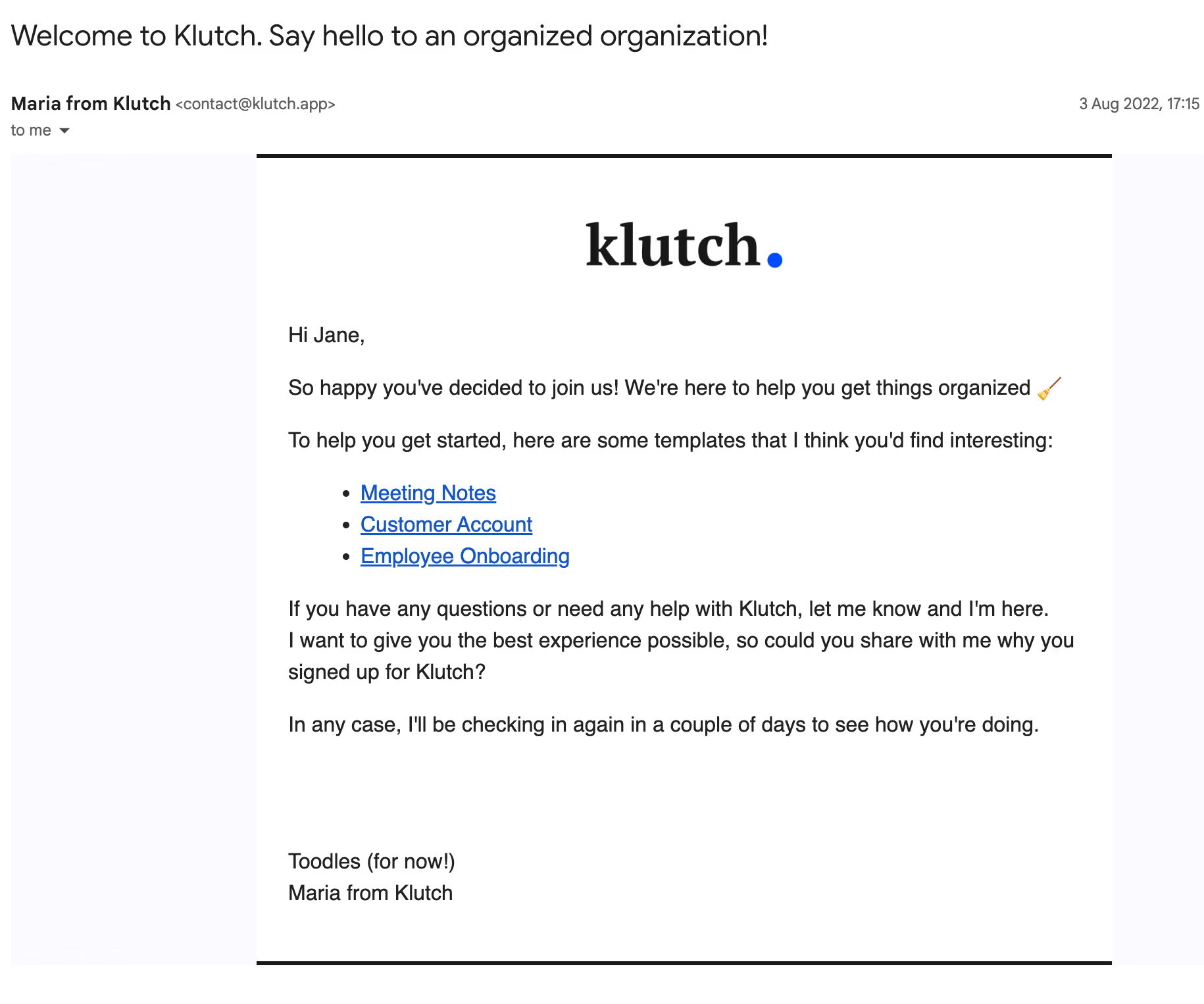
In this list of welcome email examples, here is one from Klutch – and it’s the real deal. First, look at the play on words: even though the tautology is intended, the subject line grabs the user’s attention and invites them to read the whole email. Second, the Klutch team ticked the boxes by adding the CTA (Say hello) and omitting the caps.
 5. Bolster your message with a CTA
Did you know that CTAs can increase conversions? More specifically, an enticing call-to-action button can grow your revenue by almost 2%! This is the potential of a small yet powerful UI element.
Plus, a CTA should blend in with your welcome letter copy. For instance, if you’re a pet store shop and would like to encourage new subscribers to check out the catalog, write something like Choose a gown for your pet instead of See the catalog. The latter could fit any other shop out there, couldn’t it?
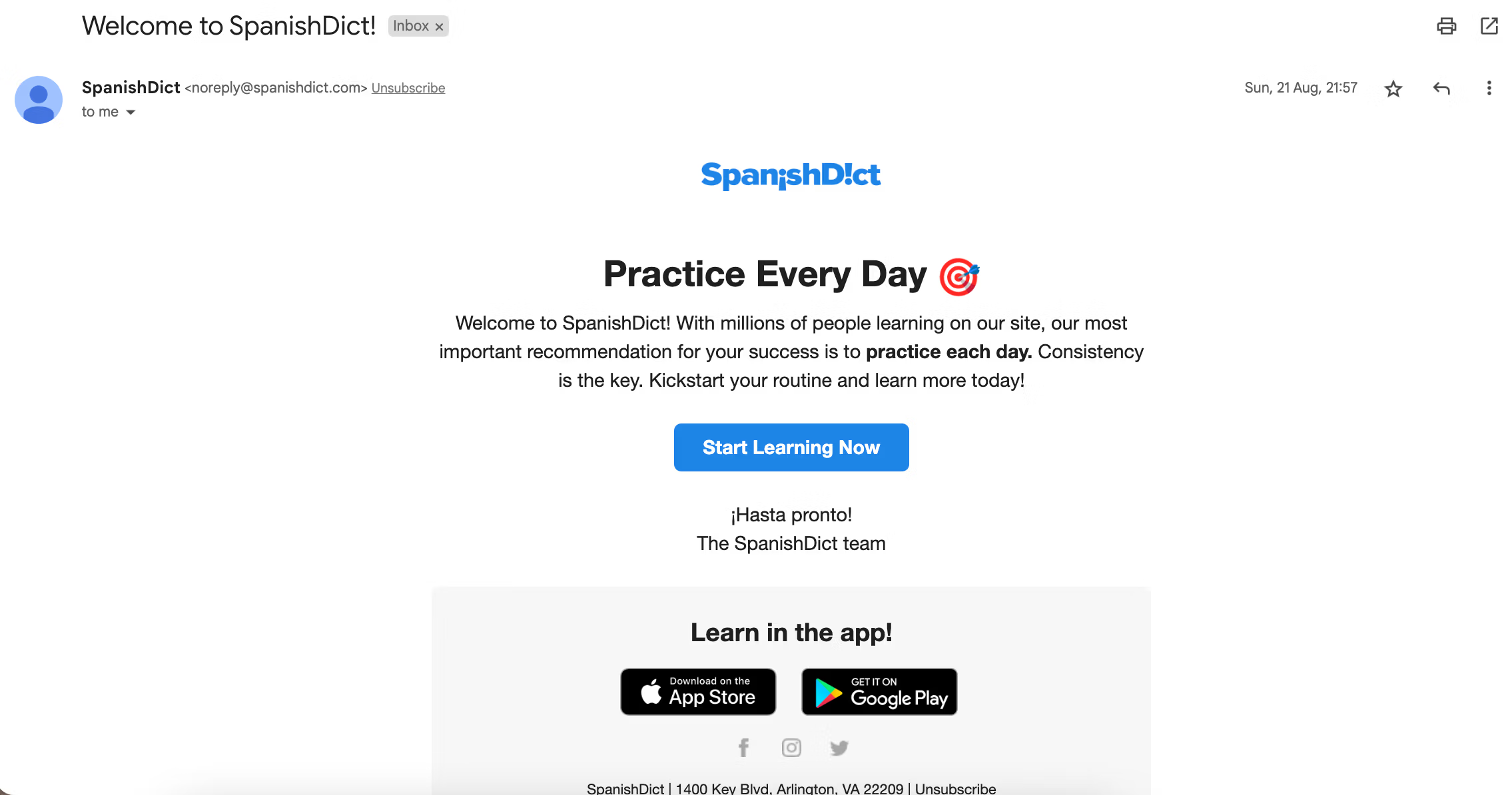
A terrific welcome email example is presented by SpanishDict! – a language learning online service. They didn’t diverge from the company’s initial area of expertise and provided the appropriate CTA:
 Having a strong CTA in your email copy can also become an important element in your lead generation funnel as potential leads wait for the guidelines on what to do next. That’s your opportunity to convert interested subscribers into leads during the awareness stage with ease.
6. Set expectations for a user
When a new subscriber joins the party, they’re facing the unknown: what will their journey with this company look like? What awaits them ahead? One may turn a blind eye to these user questions. However, if you’re a smart marketer, this won’t be the case for you.
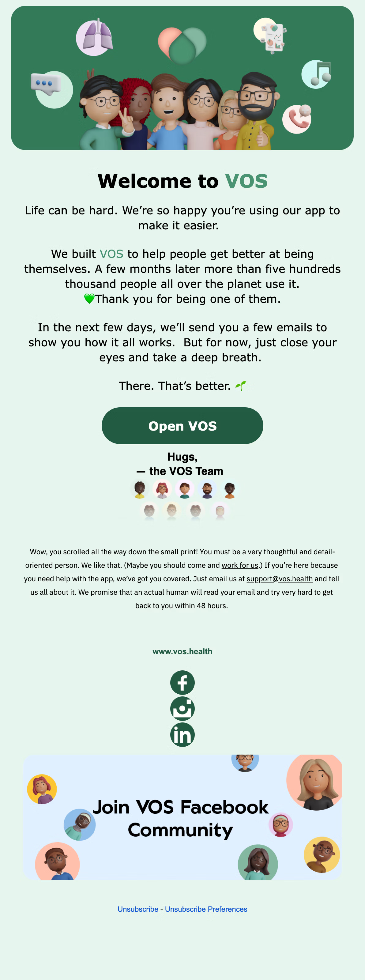
In the following welcome email example powered by VOS, the company sets clear expectations for a newly converted subscriber. They tell them what’s going to happen in the next few days – the user will receive a few emails with instructions and lead-ins about the platform.
What struck me the most is that VOS doesn’t only tell the user what the future holds, but also tries to calm them, saying “close your eyes and take a deep breath”. This is a nice addition that goes in line with the brand’s identity.
 7. Invite a customer to visit your website
Imagine you have a mobile app and a new subscriber has just knocked at your door. That’s perfect! But if you think that this is the end of the game, I will prove you wrong. Your next step is, of course, sending them a welcome letter.
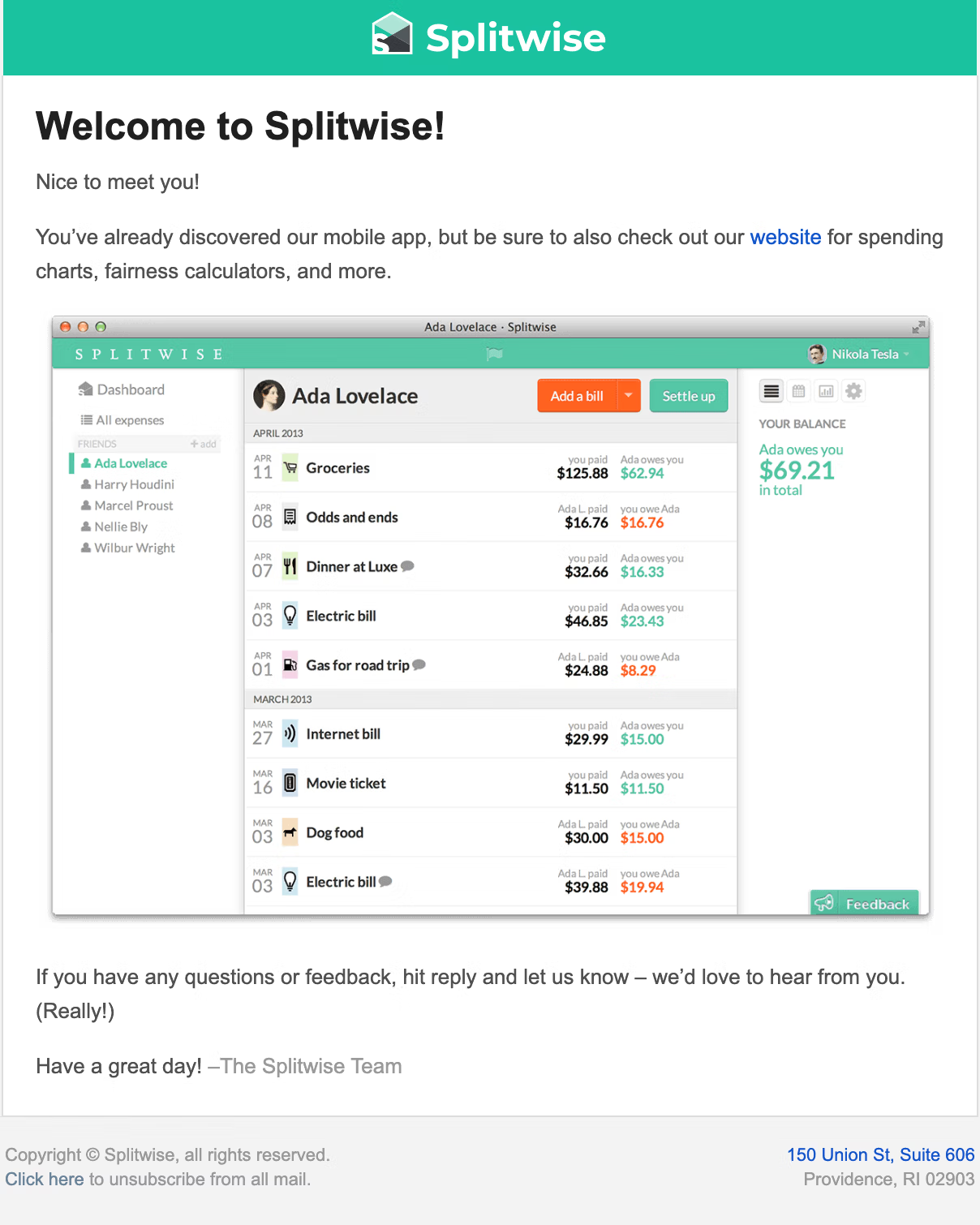
Take a look at the given welcome email example. Splitwise – a free tool for splitting the bills – has a rather straightforward message. It’s literally 3 sentences long and has a screenshot. The main point here is that they invite a user to visit the company’s website for exploring additional goodies.
This could help you promote your website’s content and boost click-through rates significantly. Do I need to highlight the ability to keep customers interested in your brand?
 If you have a social media presence and gaining followers is high on your list, you can also include social media icons in your email footer or tell website visitors how to find you on social media. The combination of this approach and the usage of a social media marketing marketplace can lead to business growth. Pretty good, isn’t it?
8. Insert a team video for a heartwarming effect
By far the greatest welcome letter tactic in all its glory. Given that it’s online communication we’re talking about, meeting your team face-to-face might be a tough nut to crack for a user. But thanks to a video, this can be easily solved with a team video.
If a picture is worth a thousand words, a 1-minute video costs 1.8 million. Adding the “faces”, especially to a welcome letter, is beneficial in so many ways:
- Transparency – you demonstrate that your company isn’t some random business that took money from users, it actually has real people in the crew;
- Personalization – people love to watch rather than read walls of text. A personalized clip where you introduce the company and welcome a new subscriber will do a better trick;
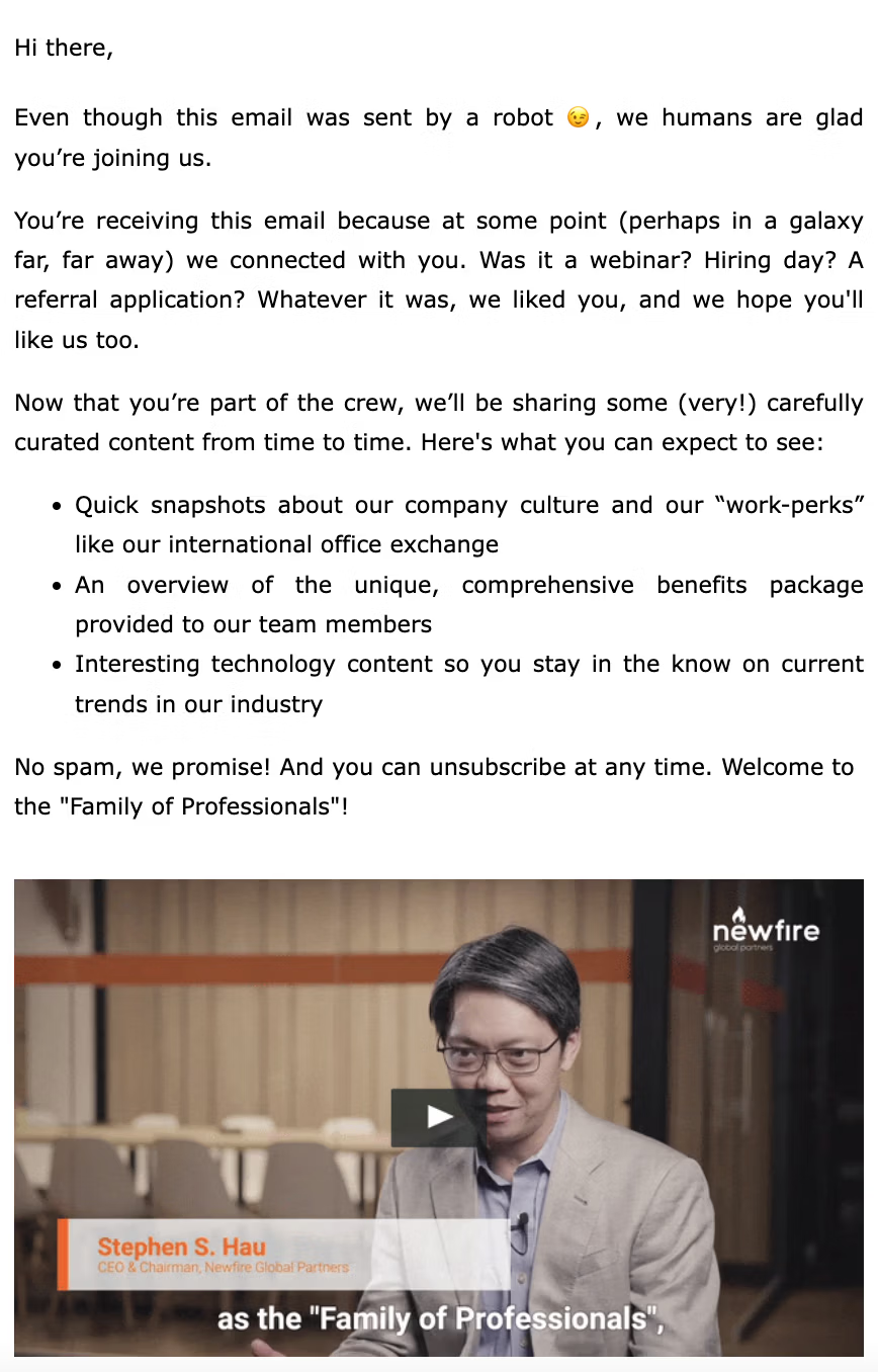
- Emotional bond – it’s better to express your feelings about a new customer (and literally show them) rather than write about it. However, you could mix business with pleasure, like it’s shown in the following Newfire Global Partners welcome email example:
 9. Highlight your value-driven attitude
When a person has just subscribed to your email list, it’s your time to shine and reveal all the aces. For that, the real value-driven attitude your business has will be spot-on.
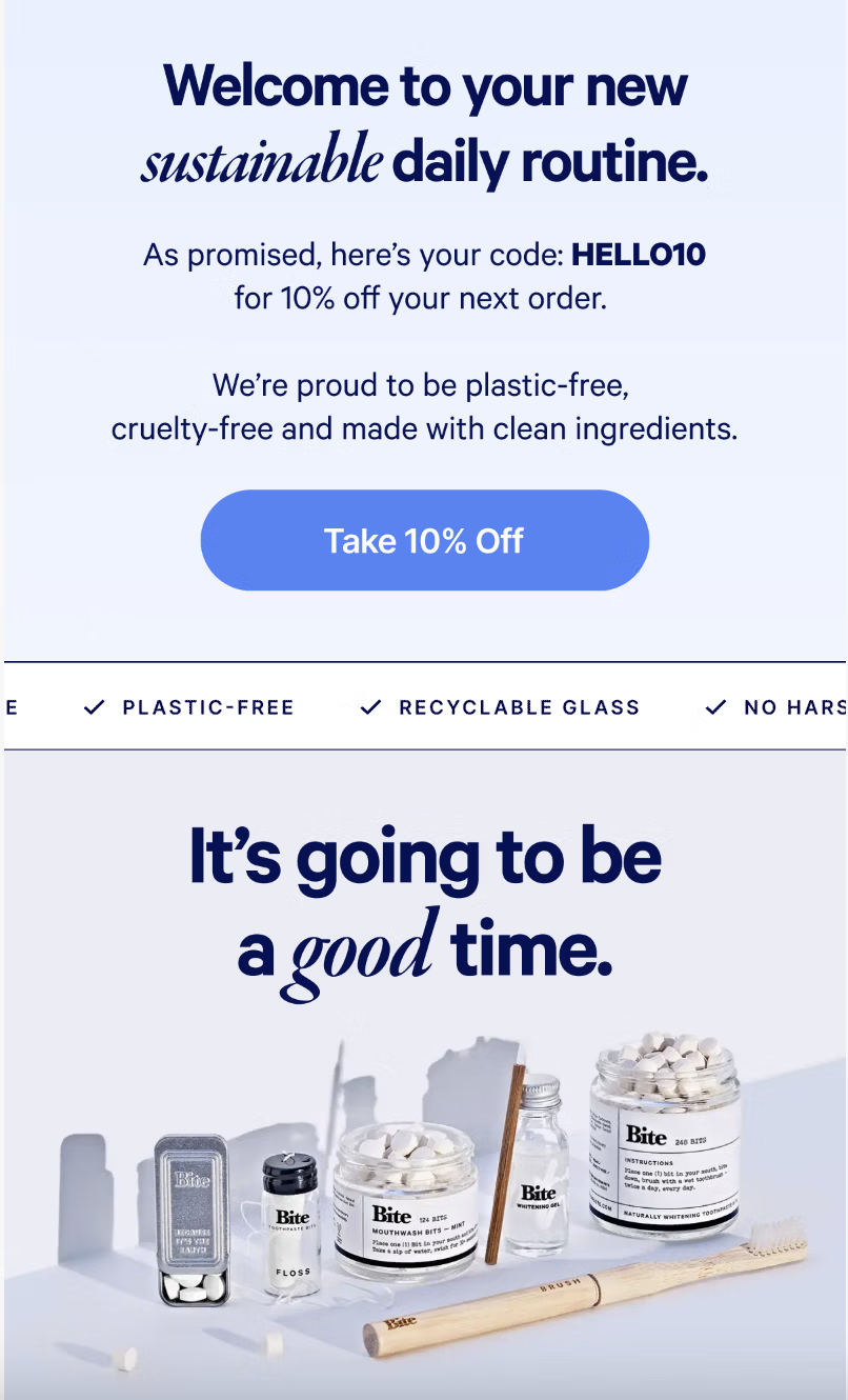
Here, we have the welcome email example from Bite – a zero-waste tooth product company. Too bad that I couldn’t capture the whole piece, however, the main element is perfectly shown. Together with the text “We’re proud to be plastic-free, cruelty-free and mad with clean ingredients”, Bite scores the bull’s eye with a ticker bar where the brand’s greater cause is stated in bullets:
 10. Consider an unsubscribe link
You know what they say: love can not be forced. What I mean is that no matter how hard you try your newcomers to grow fond of you, these efforts might be dead-end if they don’t want it. For that, there is an unsubscribe link that you can add to your welcome letters.
Almost all welcome email examples we’ve shared with you today have such links. But why don’t you look at yet another one? This is from Loom.
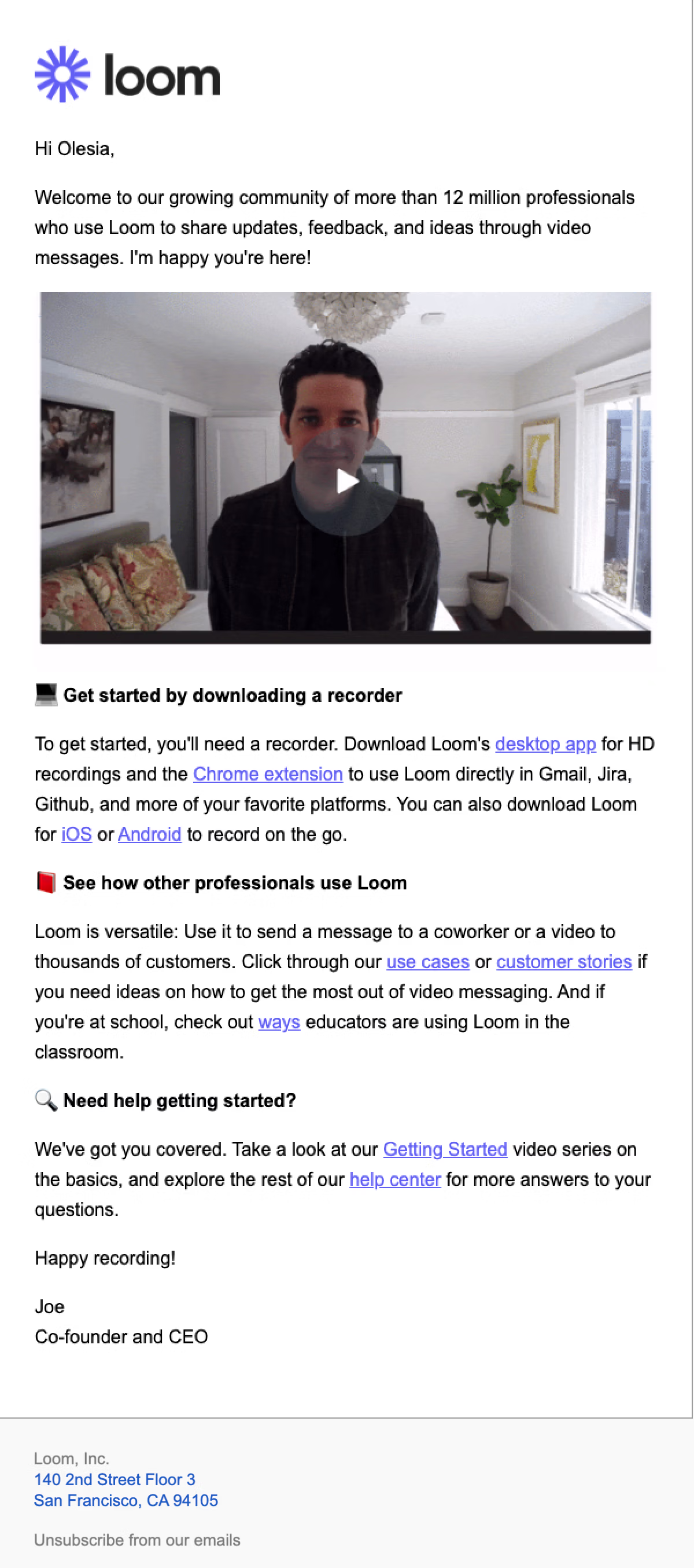 Frankly speaking, the team hits home with several points: A) they added a video with the company’s co-founder and CEO, and B) the unsubscribe link doesn’t stick out a mile. The bottom line remains: provide users with an opportunity to opt-out – who knows, maybe they will return after a while.
Final thoughts
As you can see, saying a mere Hi to a newly subscribed user is half the battle. To build bridges with them, show you will create a marvelous journey for them, and, what’s more important, drive their attention with lots of other tricks (yes, the ones we’ve described here). So hopefully, these welcome email examples will stir your creativity, and you will greet new users with open arms like a pro.